Typography - Exercises

Kitty Lai Yung Syn (0331933)
Typography
Lecture 1
26/03/2018
On the first day of lecture, Mr Vinod gave us a short briefing of what will us be doing for the following weeks. He made his word very clear that we should do our blog neat and organized. We were encouraged to borrow books from the library and share what we have learnt, on our blog every week.
On the same day, Mr Vinod introduced what is typography. From that, I learnt that typography not only about font, lettering but also the sizes, width and thickness of the line as it strongly affect the moods given to the reader. Furthermore, he also explained what are terminology, font, typeface and type family.
TERMINOLOGY
- Font: A set of printable or displayable text character s in a specific style and size.
- Typeface: (also known as font family) A particular design of type.
- Type family: Complete set of related typefaces having identical design characteristics, such as Arial, Helvetica, Times Roman out of tens of thousands of distinctive type families, each with its own name.
Lecture 2
03/04/2018
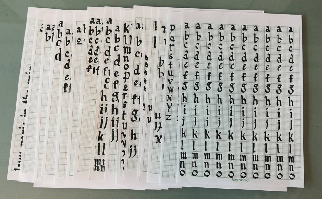
We were asked to practice vertical line, horizontal line and 'O' on a graph paper. From this exercise, I found that flat nib calligraphy pen suits me. Though it is flat nib, the pen should be slanted a bit.
For my alphabet, I chose 'Black Letter'. Also, we were advised to practice writing it consistently, not perfectly. As, we need much more practices and times to achieve perfection in calligraphy.
Lecture 3
10/04/2018
Development/Timeline
Initially writing meant scratching into wet day with sharpened stick or carving into stones with a chisel. The forms of uppercase letter forms (for nearly 2000 years the only letter forms) can be seen to have evolved out of these tools and materials.
Initially writing meant scratching into wet day with sharpened stick or carving into stones with a chisel. The forms of uppercase letter forms (for nearly 2000 years the only letter forms) can be seen to have evolved out of these tools and materials.
1750 Transitional
A refinement of old style forms. This was achieved in part because of advances in casting and printing. Thick to thin relationships were exaggerated and brackets were lightened.
Examples: Baskerville, Bulmer, Century, Time Roman
Early letterform development: Phoenician to Roman
The Greeks changed the direction of writing, Phoenicians, like other Semitic peoples, wrote from night to left. The Greek developed a style of writing called 'boustrophedon (how the ox ploughs), which meant that the lines of text read alternately from right to left and left to right. As they change the direction of reading they also changed the orientation of the letterforms.

Figure 1. Way of writing the words (Early Letterform Development:Phoenician to Roman)
Lecture 4
17/04/2018
We did not have any lecture today. The week before, we were assigned to create a font for our name based on our personality. So, this week, he taught us how to transfer our design into Adobe Illustrator and trace it out. Then, use Photoshop to make a GIF.
Lecture 5
24/04/2018
There was no any lecture today. Mr Vinod assigned us to do type expression in class.
Lecture 6
01/05/2018
There has no lecture for today as today is Labour day.
INSTRUCTION
EXERCISES
Week 1: (No exercise given.)
Week 2: We were asked to practice vertical line, horizontal line and 'O' on a graph paper, then choose 2 pieces as finals. For alphabet, I chose 'Black Letter'.
Week 2: We were asked to practice vertical line, horizontal line and 'O' on a graph paper, then choose 2 pieces as finals. For alphabet, I chose 'Black Letter'.
 |
| Figure 1.1 Practice on horizontal line, vertical line and letter 'O' |
 |
| Figure 1.2 After few times of practicing, I chose this as my final for |
 |
| Figure 1.3 Practices |
 |
| Figure 1.4 Alphabet a-o |
 |
| Figure 1.5 Alphabet p-z |
 |
| Figure 1.6 Practices 1 |
 |
| Figure 1.7 Practices 2 |
Week 3: For this week, I chose a quote, 'We don't remember days, we remember moments', as my calligraphy quote practice. Also, we have to write the quote in the middle of the graph paper, then plain paper.
 |
| Figure 1.8 Quote on graph paper |
 |
| Figure 1.9 Quote on A4 plain paper (Final) |
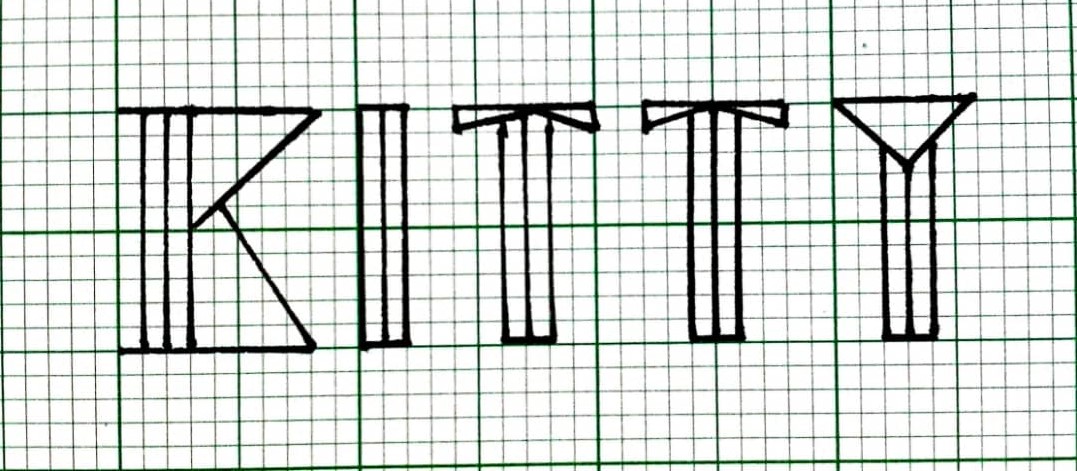
Week 4: We were asked to create name lettering based on our personality. So I had drew some of the design (as shown below). After chosen the font style that suit me, which is based on my own personality, we used Adobe Illustrator and Photoshop to do a GIF. (Processes are shown below)
 |
| Figure 2.0 Sketch |
 |
| Figure 2.1 Process 1 |
 |
| Figure 2.2 Process 2 |
 |
| Figure 2.3 Process 3 |
 |
| Figure 2.4 Final outcome - name lettering GIF (party person) |
 |
| Figure 2.5 Font expression (quick, loud, dead, stress, dark, drunk) |
 |
| Figure 2.6 Process of creating GIF |
 |
| Figure 2.7 Final Outcome - Font Expression GIF (Stress) |
FEEDBACK
Week 1: Today we did not have any lecture nor exercises. Mr Vinod only brief us the module.
Week 2: Today Mr. Vinod told us that we have to practice a lot until we get consistent calligraphy, instead of writing it perfectly. After doing all the practices, I realized that we cannot pressed to hard on the paper and we should hold our calligraphy pen slanted.
Week 3: I was told that my vertical line and horizontal are quite fine, just that the spacing are not even. For my alphabet, though I can't submitted on that day(because of running out of ink and the pen was out of stock), Mr Vinod still gave me some comments. He said the spacing of my alphabet writing should be even and some words were writen too big as compare to the others, especially the letter 'g'.
Week 4: The quote I wrote was 'we don't remember days we remember moments'. Mr Vinod told me that the way I held the pen was wrong because the strokes were too slanted. For general feedback, were were advised, we should write our name and student ID and the date behind the A4 paper as the page we wrote our quote is our artwork, so the whole page should only have the artwork on it.
Week 5: Mr. Vinod said we can use our time on next Tuesday (Week 6) to complete our blog. Other than that, he said we are not creative enough. For my name lettering GIF, he said that my light blinking effect is fine but not related to positivity(my personality), but more like a party-going. He said it is okay to stick to positivity, but he suggested me to change the background to black. For my type expression, he said that my stress is quite interesting. However the word 'QUICK' was not quick enough, the 'LOUD' was not loud enough. Others are fine.
Week 6: There has no lecture for today as today is Labour day. But Mr. Vinod told us to update our blog and accomplish works on today.
REFLECTION
Experience
Week 1: We didn't have any assignment and exercise for this week. During lecture, I had jotted down all the notes Mr Vinod taught us in class.
Week 2: It was a great experience for me because I was listening to songs while I was writing. Though is a long lecture/tutorial/practical class, I was enjoying while I was writing calligraphy.
Week 3: I like how Mr Vinod gave us comment one by one on our artworks. He motivated me and encouraged me by saying I have some potential and I could do it.
Week 4: I think the words on the slides should be bigger and clearer because people sitting at the back could hardly see the word. In my opinion, the content could be arranged into point forms instead of one whole paragraph as this would be more easier for us to jot down notes and straightforward understand what that was all about. Furthermore, we learned some history of typography today and the lecture was fine.
Week 5: Type expression exercise has given me a lesson on how to use type to express and also, my eyesight has been expanded through this exercise by trying out new things and looking others designs.
Observation
Week 1: On the first week, I had observed that different fonts have their history and meaning.
Week 2: Although I was using a flat nib calligraphy pen, I had to hold it slanted a bit.
Week 3: My spacing are not even when I was writing calligraphy.
Week 4: The way I held my calligraphy pen were too slanted.
Week 5: When we are designing type expression, it should not be too illustrative, instead we should make it more simple and use the word itself to express, not effects.
Findings
Week 1: I realized that typography not just only about lettering and calligraphy. They have history and characteristic, mood and meaning in it.
Week 2: I noticed that flat nib calligraphy pen suits me more. We aimed to write it consistently not perfectly.
Week 3: I should be paying more attention to the size of the word and the spacing when I was writing calligraphy.
Week 4: The way I wrote with calligraphy pen were wrong. I should not force my hand to create the shape of the word, instead I should hold it a bit more horizontally to create the shape.
Week 5: Type expression is the word itself expressing the feeling, not the help of the effects to bring out the emotions.
FURTHER READING (Week 1 - Week 6)
Week 1 - 2


Figure 3.1 The Compete Typographer (2nd Edition) by Will Hill

Figure 3.2 Introduction to typeface

Figure 3.3 Terminology
The Compete Typographer (2nd Edition) by Will Hill
Typeface
- normally includes a number of separate fonts, including roman, italic, and at least one variant weight, normally described as bold
- variants that share a common width and proportion are seen as part of the same face, whereas related forms of differing width are more likely to be described as different faces within the same type family
What does a typeface contain?
- the design of bold italic forms form historic typefaces has often taken place at a much later date and been achieved with varying degrees of sensitivity
- the relationships between the italic and the roman, or upright, form vary considerably between one typeface and another
- the convention is that every typeface should be designed with an italic version is a slightly later development in type history
- many 19th- and 20th-century typefaces in these idioms actually draw upon different but contemporaneous sources for their italics
Week 3 - 4


Figure 3.4 Type Matters! by Jim Williams

Figure 3.5 Legibility and readability

Figure 3.6 Differences between legibility and readability

Figure 3.7 Shape

Figure 3.8 How line breaks in centred text setting
"A good typographer is one who can arrange type so as to produce a graceful and orderly page that puts no strain on the eye."
Legibility - easily readable / the clarity of individual characters and how easily they are deciphered
Readability - the property of being capable of being read / the level of comprehension and visual comfort when reading typeset material.
Week 5 - 6


Stop stealing Sheep & find out how type works (Second Edition) by Erik Spiekermann & E.M. Ginger
Type with a purpose:
- Choosing typefaces for a design job is a very similar experience to packing your suitcase in a rush and you can't decide what to put into it.
- Design is all about striking a balance between practicality and aesthetics.
- The typographic equivalents are those typefaces that are comfortable to read.
- "Loose fit" is actually a typesetting term describing letters that have a comfortable amount of space between them.
- Most type is used for business communication of one sort or another, so it has to conform to written and unwritten rules of the corporate world.


Comments
Post a Comment