Advanced Typography (R) - Exercises

27/08/2018 - 24/09/2018 (Week 1 - Week 5)
Kitty Lai Yung Syn (0331933)
Advanced Typography - Exercises
LECTURE 1
27/08/2018
After our long semester break, finally we were back in our Design Journey. So, in our first lecture of Advanced Typography, Mr Vinod gave us a very interesting task. He gave us around 10 min to do research on Typographic System and presented by groups. Ours topic is Dilatational System. Below is the slide on typographic systems.
LECTURE 2
03/09/2018
Today Mr Vinod gave us some feedback on our exercises. Some of us were asked to redo in class after the critic session. No lecture was given but we were briefed on our next exercises.
03/09/2018
Today Mr Vinod gave us some feedback on our exercises. Some of us were asked to redo in class after the critic session. No lecture was given but we were briefed on our next exercises.
INSTRUCTION
PDF File
EXERCISES
EXERCISE 1
Week 3
This is our first exercise. In this exercise we have to create 2 artworks for each 8 typographic systems.
 |
| 8 Typographic Systems in InDesign |
Embedded Typographic Systems (PDF)
EXERCISE 2A
Week 4
For the next exercise., I took a photograph of a patterns or prints on moon cake festival box. Then I used yellow line to trace out the alphabet, which are: V, F Y and L.
 |
| Photo taken (original photo) |
 |
| I used yellow line to trace out the possible alphabet. |
 |
| 4 Alphabets founded from the photo. |
Attempt 1
Attempt 2
Attempt 3
I found that the origin of the alphabet is not consistent and the stroke is quite thick. From attempt 1 to 3, I was trying to cut the the bumpiness but attempted to capture the characteristic of the origin look of the alphabet.
I was given an suggestion that the alphabet can be less bumpier. So far, the stroke is too thin. I might have to thicken the stoke, straighten the alphabet a bit so that is clear to read and the form of the alphabet is distinctly shown.
Attempt 4 (Final Outcome)
So here is the final outcome! The form is clear and I chose the movement of the plant to be the main characteristic of my font.
EXERCISE 2B
In this exercise we are tasked to interplay between letter/word/sentence and the selected image. The text must be woven into a symbiotic relationship with the image.
https://www.360cities.net/image/cheongye-artificial-stream-near-mojeon-bridge-seoul
FEEDBACK
EXERCISE 1
Mr Shamsul reminds me to add a colour on the 8 typographic systems exercises.
EXERCISE 2A
Mr Shamsul suggested that I could make it less bumpy and the final can be more straight and the alphabet is more clear to read.
EXERCISE 2B
Mr Vinod said think of the topic of my image and how to use the words to play with it and at the same time related to the topic.
REFLECTION
EXPERIENCE
Exercise 1: We we asked to design a layout by using 8 typographic systems.
Exercise 2A: I had experienced on observing things around us more sensitively and create a new typeface.
Exercise 2B: I love how to play font with image. This has made the image more fun and lively to express.
OBSERVATIONS
Exercise 1: I observed that layout or poster could look better if we apply these 8 systems and aligned them well.
Exercise 2A: I have observed that how to get inspired by the nature and from all the surroundings.
Exercise 2B: I have observed that choosing a image, typeface and also intersect the image and the font, has to choose wisely as it could message delivered to audiences.
FINDINGS
Exercise 1: I found that these 8 typographic systems can be applied in many ways instead of the references
Exercise 2A: I found that getting more ideas from our surroundings are better than just looking from internet or books.
Exercise 2B: I found that this exercise is very fun and interesting. By intersecting the image and the font could be strengthen and clarify the message that delivered to the audiences.
FURTHER READING

Exploring Typography (Second Edition) by Tova Rabinowitz Deer

 |
| Original Photo (taken in Korea) |
This is a photo of Cheonggyecheon stream I taken in Korea.
The restoration work for the Cheonggyecheon is also associated with the effort to regain its pride as a nation with splendid traditional culture through restoring some historical objects like Gwangtonggyo (Bridge), a representative one built during the Joseon Dynasty.
The Cheonggyecheon used to be a naturally formed stream before Seoul was designated to be the capital in Joseon Dynasty. After the period from Korean war (1950~1953), there are even more people swarmed into Seoul to seek their way and make their living and settled down along the stream.
 |
| Attempt 1 |
 |
| Attempt 2 |
 |
| Attempt 3 |
 |
| Final outcome |
FEEDBACK
EXERCISE 1
Mr Shamsul reminds me to add a colour on the 8 typographic systems exercises.
EXERCISE 2A
Mr Shamsul suggested that I could make it less bumpy and the final can be more straight and the alphabet is more clear to read.
EXERCISE 2B
Mr Vinod said think of the topic of my image and how to use the words to play with it and at the same time related to the topic.
REFLECTION
EXPERIENCE
Exercise 1: We we asked to design a layout by using 8 typographic systems.
Exercise 2A: I had experienced on observing things around us more sensitively and create a new typeface.
Exercise 2B: I love how to play font with image. This has made the image more fun and lively to express.
OBSERVATIONS
Exercise 1: I observed that layout or poster could look better if we apply these 8 systems and aligned them well.
Exercise 2A: I have observed that how to get inspired by the nature and from all the surroundings.
Exercise 2B: I have observed that choosing a image, typeface and also intersect the image and the font, has to choose wisely as it could message delivered to audiences.
FINDINGS
Exercise 1: I found that these 8 typographic systems can be applied in many ways instead of the references
Exercise 2A: I found that getting more ideas from our surroundings are better than just looking from internet or books.
Exercise 2B: I found that this exercise is very fun and interesting. By intersecting the image and the font could be strengthen and clarify the message that delivered to the audiences.
FURTHER READING

- An important concept that helps designers enhance the communicative nature of their design is graphic resonance. Graphic resonance refers to the underlying tone of design. The designer sets the tone by utilising connotative elements in the design; that is, elements which evoke emotions or suggest associations with familiar experiences and memories.
- Designers create information (also called infographics) to help readers quickly and easily visualise data. These graphics must quickly and concisely communicate utilitarian information to their audiences. The need to simplify information is especially relevant when creating information graphics, since readers are often likely to be rushed or even unreceptive to reading the information.
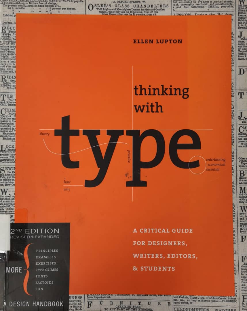
Thinking with Type by Ellen Lupton
- Choose a text has recurring structure such as table of contents, a news aggregator or a calender of events. Analyze the structure of the content (main title, subtitles, time location, body text, and so on) and create a visual hierarchy that expressed this structure.
- Good typography is heard, not seen sometimes. Visually impaired users employ automated screen readers that linearize websites into a continuous text that can be read aloud by a machine. Techniques for achieving successful linearization include avoiding layout tables; consistently using alt tags, image captions, and front of repeated navigation elements that enable users to go directly to the main content.
Comments
Post a Comment