Typography - Final Project

29/05/18 – 26/06/18 (Week 10 – Week 14)
Kitty Lai Yung Syn (0331933)
Typography
Final Project - Event Typography
LECTURE 10
29/05/2018
There was no lecture given today because it was a public holiday. But, Mr Vinod has tasked us on writing what we hate and what we love in 150 words each. With the 150 words written, format the text adhering to the tone of the written information on two A4 pages in a square of 200 x 200mm (0.5pt stroke width outline). Use one A4 for; somthing I love text; and another A4 for the something I hate text. Below are the instructions he gave us.
LECTURE 11
05/06/2018
Today was the first time Mr Shamsul giving lecture to us. I could see how nervous he was but overall I like the speed on how he explain. So, we learnt about 'Typography in Different Medium'.
Type for Print
Type was designed intended for reading from print long before we read from screen. It's the designer's job to ensure that the text is smooth, flowing and pleasant to read. A good typeface for print - Caslon, Garamond, Baskerville are the most common typefaces that is used for print. Because of their characteristic which are elegant and intellectual but also highly readable when set at small font size. They are versatile, easy-to-digest classic typeface, which has a neutrality and versatility that makes typesetting with it a breeze.
Type for Screen
Typefaces intended for use on the web are optimized and often modified to enhance readability and performance onscreen in a variety of digital environments. This can include a taller x-height (or reduces ascenders and descenders), wider letterforms, more open counters, heavier thin strokes and serifs, reduced stroke contrast, as well as modified curves and angles for some designs. Another important adjustment – especially for typefaces intended for smaller sizes – is more open spacing. All of these factors serve to improve character recognition and overall readability in the non-print environment, which can include the web, e-books, e-readers, and mobile devices.
Hyperactive Link/ Hyperlink
A hyperlink is a word, phrase, or image that you can click on to jump to a new document or a new section within the current document. Hyperlinks are found in nearly all Web pages, allowing users to click their way from page to another. Text hyperlinks are normally blue and underlined by default. When you move the cursor over a hyperlink, whether it is text or an image, the arrow should change to a small hand pointing at the link.
Font Size for Screen
16-pixel text on a screen is about the same size as text printed in a book or magazine; this is accounting for reading distance. Because we read books pretty close—often only a few inches away—they are typically set at about 10 points. If you were to read them at arm’s length, you’d want at least 12 points, which is about the same size as 16 pixels on most screens.
System Fonts for Screen/ Web Safe Fonts
Each device comes with its own pre-installed font selection. Which is based largely on its operating system. The problem is that each differs a little bit. Windows-based devices might have one group. While MacOS ones pull from another. Then Google’s own Android system uses their own as well. Let’s say the designer picked some obscure, paid font family for this site’s design. If you don’t have that font already installed and it’s not pulling from a web-friendly place – more on that later – the font you see would default back to some basic variation like Times New Roman. You, as the visitor, wouldn’t necessarily know that’s what happened, though. To you, it would just look plain ugly. ‘Web safe’ ones, however, appear across all operating systems. They’re the small collection of fonts that overlap from Windows to Mac to Google.
(Safe fonts examples: Open Sans, Lato, Arial, Helvetica, Times New Roman, Times, Courier New, Courier, Verdana, Georgia, Palatino, Garamond)
Pixel Differential Between Devices
The screens used by our PCs, tablets, phones and TVs are not only different sizes, but the text you see on-screen differs in proportion too, because they have different sized pixels. 100 pixels on a laptop is very different from 100 pixels on a big 60″ HDTV. Even within a single device class there will be a lot of variation.
Static typography
Static typography has minimal characteristic in expressing words. Traditional characteristics such as bold and italic offer only a fraction of the expressive potential of dynamic properties. From billboards to posters, magazines to fliers, we encounter all forms of static typography with wide ranging purposes. Whether they are informational, promotional, formal or aspirational pieces of designs, the level of impression and impact they leave on the audience is closely knitted to their emotional connection with the viewers.
Motion Typography
LECTURE 10
29/05/2018
There was no lecture given today because it was a public holiday. But, Mr Vinod has tasked us on writing what we hate and what we love in 150 words each. With the 150 words written, format the text adhering to the tone of the written information on two A4 pages in a square of 200 x 200mm (0.5pt stroke width outline). Use one A4 for; somthing I love text; and another A4 for the something I hate text. Below are the instructions he gave us.
- Set a margin. Create columns and rows.
- Choose an appropriate typeface from the 10 given (for love and hate respectively)
- Format the text while considering the point size, line length, alignment, ragging and tracking.
- Save as PDF, upload to G-Drive and embed onto eportfolio.
- Print out on A4 and bring to the next class.
LECTURE 11
05/06/2018
Today was the first time Mr Shamsul giving lecture to us. I could see how nervous he was but overall I like the speed on how he explain. So, we learnt about 'Typography in Different Medium'.
Type for Print
Type was designed intended for reading from print long before we read from screen. It's the designer's job to ensure that the text is smooth, flowing and pleasant to read. A good typeface for print - Caslon, Garamond, Baskerville are the most common typefaces that is used for print. Because of their characteristic which are elegant and intellectual but also highly readable when set at small font size. They are versatile, easy-to-digest classic typeface, which has a neutrality and versatility that makes typesetting with it a breeze.
Type for Screen
Typefaces intended for use on the web are optimized and often modified to enhance readability and performance onscreen in a variety of digital environments. This can include a taller x-height (or reduces ascenders and descenders), wider letterforms, more open counters, heavier thin strokes and serifs, reduced stroke contrast, as well as modified curves and angles for some designs. Another important adjustment – especially for typefaces intended for smaller sizes – is more open spacing. All of these factors serve to improve character recognition and overall readability in the non-print environment, which can include the web, e-books, e-readers, and mobile devices.
Hyperactive Link/ Hyperlink
A hyperlink is a word, phrase, or image that you can click on to jump to a new document or a new section within the current document. Hyperlinks are found in nearly all Web pages, allowing users to click their way from page to another. Text hyperlinks are normally blue and underlined by default. When you move the cursor over a hyperlink, whether it is text or an image, the arrow should change to a small hand pointing at the link.
Font Size for Screen
16-pixel text on a screen is about the same size as text printed in a book or magazine; this is accounting for reading distance. Because we read books pretty close—often only a few inches away—they are typically set at about 10 points. If you were to read them at arm’s length, you’d want at least 12 points, which is about the same size as 16 pixels on most screens.
System Fonts for Screen/ Web Safe Fonts
Each device comes with its own pre-installed font selection. Which is based largely on its operating system. The problem is that each differs a little bit. Windows-based devices might have one group. While MacOS ones pull from another. Then Google’s own Android system uses their own as well. Let’s say the designer picked some obscure, paid font family for this site’s design. If you don’t have that font already installed and it’s not pulling from a web-friendly place – more on that later – the font you see would default back to some basic variation like Times New Roman. You, as the visitor, wouldn’t necessarily know that’s what happened, though. To you, it would just look plain ugly. ‘Web safe’ ones, however, appear across all operating systems. They’re the small collection of fonts that overlap from Windows to Mac to Google.
(Safe fonts examples: Open Sans, Lato, Arial, Helvetica, Times New Roman, Times, Courier New, Courier, Verdana, Georgia, Palatino, Garamond)
Pixel Differential Between Devices
The screens used by our PCs, tablets, phones and TVs are not only different sizes, but the text you see on-screen differs in proportion too, because they have different sized pixels. 100 pixels on a laptop is very different from 100 pixels on a big 60″ HDTV. Even within a single device class there will be a lot of variation.
Static typography
Static typography has minimal characteristic in expressing words. Traditional characteristics such as bold and italic offer only a fraction of the expressive potential of dynamic properties. From billboards to posters, magazines to fliers, we encounter all forms of static typography with wide ranging purposes. Whether they are informational, promotional, formal or aspirational pieces of designs, the level of impression and impact they leave on the audience is closely knitted to their emotional connection with the viewers.
Motion Typography
Temporal media offer typographers opportunities to “dramatize” type,
for letterforms to become “fluid” and “kinetic” (Woolman and
Bellantoni, 1999). Film title credits present typographic information
over time, often bringing it to life through animation. Motion graphics,
particularly the brand identities of film and television production
companies, increasingly contain animated type. Type is often overlaid onto music videos and advertisements, often
set in motion following the rhythm of a soundtrack. On-screen
typography has developed to become expressive, helping to
establish the tone of associated content or express a set of brand
values. In title sequences, typography must prepare the audience for
the film by evoking a certain mood.
LECTURE 12
INSTRUCTION
LECTURE 12
12/6/2018
No lecture was given today due to Raya holiday. Mr Vinod has given task and we have to complete it by this day. For this Raya week, we have to come up with one short title for the both texts. Then, sketch 3 possible ways of expressing our title. All 3 options are to be sketched on an A4 paper and later an image to be uploaded to our eportfolio post for final project (Event Typography). This title will later be used along with the love and hate text that we have written previously. A more detailed explanation will be given on June 19. (Below: To summarize our task on Tuesday)- Come up with a short title
- Sketch 3 (A4) options expressing my title
- Upload image of sketches to eportfolio post for the Final Project (Event Typography)
INSTRUCTION
FINAL PROJECT
We were tasked to write what we hate and what we love in 150 words each. Below are the content for the essays.
WHAT I LOVE
I love music. Music is a must in my every day life, even in
every single moment. My sister started to go singing contest at the age of 3, I
think that’s why I’m so attached to music. At my age 3 or 4, my mother sent me to
singing classes; at the age of 9, I went to piano lesson. I stopped my singing
classes at the age of 12 and continued my piano journey.
Apart from these, I
listen to certain music on my certain mood. Thus, I categorize my playlist in
different moods and, different singers. This is because, most of the singers
have their own style of song. For example, Joker Xue, a Chinese singer, is
well-known in his sad song because of his deep manly voice. Not only the rhythm
of the music, the tone and every word of the singer sings can affect my
feelings and my mood.
WHAT I HATE
What I really hate is watching my parents getting old and weak. I could not imagine or face the fact of my parents leaving me one day. Even letting them to wait for us, I could not even stand something like this, I would feel guilty deep inside.
I was an irritable kid. This is because I had had this thought of my parents were more favour towards my elder sister. Because of this, I keep on infecting anger and snappish temperament to my parents. They always punished me due to my bad temper.
After I left home for my study, I realized I started to change my attitude and noticed that I should not be more grateful for having my parents. Now, I am quite worried my parents as their body condition is getting weak. Fortunately, at least I had changed myself and become more appreciate what I am having now, before everything is too late.
PDF File 1
 |
| Figure 1.1 Sketches of Titles |
 |
| Figure 1.2 Sketches of layouts |
 |
| Figure 1.3 First attempt (Right) |
 |
| Figure 1.4 Second attempt (Right) |
 |
| Figure 1.5 First attempt (Left) |
 |
| Figure 1.6 Second attempt (Left) |
 |
| Figure 1.7 Tryouts |
PDF File of tryouts
 |
| Figure 1.8 Final Outcome |
Before this artwork was created, the space/empty part I used in this artwork, was a new exploration to me. I was trying to create a collage background but then, I accidentally created a text box on it. I found it the spacing is showing a better result of the construction of the text.
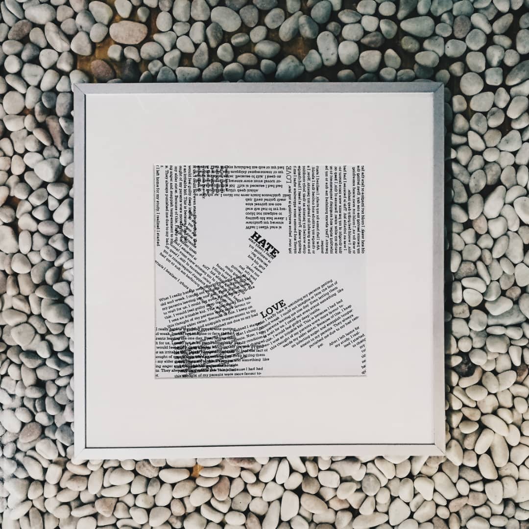 |
| Figure 1.9 Final outcome in frame |
Final Outcome in PDF
FEEDBACK
Week 10: (No class for today due to public holiday.)
Week 11: While we were creating our font, we have to measure it very accurately and be consistent of the contrast of the alphabet. Specifically, I was told to redo Project 2 because Mr Vinod said he could till see the characteristic of the default font I used for reference.
Week 12: (No class for today due to Raya holiday.)
Week 13: Further Reading is counted as a research on certain project. If we left that part empty on the blog, we would be no marks for the research part.
REFLECTION
Experiences
Week 11: I understood that how important is a lecture with students interaction. This could let the lecturer know what we don't understand.
Week 13: I like how was the experiences on placing the texts without any restricts and rules.
Observations
Week 11: I have observed that we were quite quiet during the lecture, and Mr Shamsul might not know if we were really understand what he was delivering to the us.
Week 13: I looked around others outcome and I have observed there are so creative and they are the one I can learn things from.
Findings
Week 11: I found out that type sizes are so important not only on graphic but also on screen and web. I learned about the differences between static and motion typography and the pixels and the size of fonts presenting on a different screen.
Week 13: I found so fun when we were placing the text as the way we wanted, playing around with the composition.
FURTHER READING (Week 11 - 13)
Week 11 - 13
 |
| Figure 2.1 Cover and Back Cover |
 |
| Figure 2.2 |
 |
| Figure 2.3 |
 |
| Figure 2.4 |
 |
| Figure 2.5 |
 |
| Figure 2.6 |
 |
| Figure 2.7 |
 |
| Figure 2.8 |
 |
| Figure 2.9 |
 |
| Figure 3. |
 |
| Figure 3.1 |
 |
| Figure 3.2 |
- The straight and curved of characters can be physically rendered and combined in a wide variety of ways to suggest a full range of meanings and associations, independent of the type's content
- Typographic scale made up of units called picas and points
- Studying typographic terminology related to type anatomy and structure not only increases awareness of these subtle physical differences, but also facilitates effective communication about type and support informed design decision-making


Exploring Typography Second Edition by Tova Rabinowitz Deer
- Trying our hand at designing a font can make our task much easier by keeping good records, conducting a significant amount of research, selecting an appropriate design strategy, and making well-planned decisions about the font's design elements.
- Quality of a font is often judged by its optical consistency, legibility and readability.
- Appropriate spacing is important to the legibility and readability of a font.


Comments
Post a Comment